Interpretation of Results
Source:vignettes/articles/cookbook_interpretation.Rmd
cookbook_interpretation.RmdThis section provides guidance on interpreting key metrics used in PACTA alignment assessments. It explains how different methodologies, including the Target Market Share and Sectoral Decarbonization approaches, evaluate portfolio alignment with climate transition scenarios. By understanding these outputs users can assess their portfolio’s position relative to sector-wide decarbonization goals and transition risks.
Target Market Share
The target market share approach is used to calculate PACTA alignment metrics for the automotive, coal mining, oil & gas and power sectors. These sectors share two key characteristics:
- production pathway scenarios are available by technology or fuel type
- asset-based company data at the same level of technological granularity is also available
The target market share approach can be extended to any sector that meets these conditions. The core idea is that each actor maintains a constant market share in output units while proportionally reducing high-carbon technologies and increasing low-carbon alternatives, assuming all actors follow the same strategy. In aggregate, this ensures alignment with the sector’s transition pathway.
For more details on the Target Market Share metric and its calculation, see the Metrics appendix.
target_market_share() function
The target_market_share() function calculates the Target
Market Share metric and outputs a table including the calculated targets
at the portfolio level or at the company level, depending on the options
selected.
Explanation of Output
The primary variables of interest in the output are
production and metric. The
production variable’s meaning depends on the
metric column and other preceding columns. If
metric is "projected", then
production represents the portfolio’s projected production
output based on ABCD data for the specified sector, technology, year,
and scenario. If metric starts with "target_"
(e.g., "target_cps"), production represents the target
production level for that sector and scenario,
derived from the portfolio’s initial ABCD production and following the
relative required changes of the scenario according to the market share
approach. If metric is "corporate_economy",
then production reflects the total sector production in a
given region, calculated using the ABCD. This serves as a benchmark for
comparison.
For example, the output table could be filtered to view the projected coal power production values for your portfolio:
dplyr::filter(
  market_share_demo,
  metric == "projected",
  technology == "coalcap"
)
#> # A tibble: 21 × 10
#>    sector technology  year region scenario_source metric    production technology_share scope      percentage_of_initial_production_by_scope
#>    <chr>  <chr>      <int> <chr>  <chr>           <chr>          <dbl>            <dbl> <chr>                                          <dbl>
#>  1 power  coalcap     2020 global demo_2020       projected     21766.            0.132 technology                                   0
#>  2 power  coalcap     2021 global demo_2020       projected     21957.            0.132 technology                                   0.00878
#>  3 power  coalcap     2022 global demo_2020       projected     22148.            0.132 technology                                   0.0176
#>  4 power  coalcap     2023 global demo_2020       projected     22340.            0.129 technology                                   0.0263
#>  5 power  coalcap     2024 global demo_2020       projected     22531.            0.129 technology                                   0.0351
#>  6 power  coalcap     2025 global demo_2020       projected     20104.            0.124 technology                                  -0.0764
#>  7 power  coalcap     2026 global demo_2020       projected     20266.            0.125 technology                                  -0.0689
#>  8 power  coalcap     2027 global demo_2020       projected     20427.            0.126 technology                                  -0.0615
#>  9 power  coalcap     2028 global demo_2020       projected     20589.            0.126 technology                                  -0.0541
#> 10 power  coalcap     2029 global demo_2020       projected     20751.            0.128 technology                                  -0.0466
#> # ℹ 11 more rows
Additional variables include technology_share, which
represents the share of a given technology within the sector, and
percentage_of_initial_production_by_scope, which shows the
relative change in production compared to the start year.
Both are derived from the production variable. The
technology_share values can be visualized in the technology mix
plots.
If by_company = TRUE and
weight_production = FALSE are used in
target_market_share(), the output is interpreted relative
to the company listed in the name_abcd column.
For a detailed breakdown of target_market_share()’s
output table and its columns, see the data
dictionary.
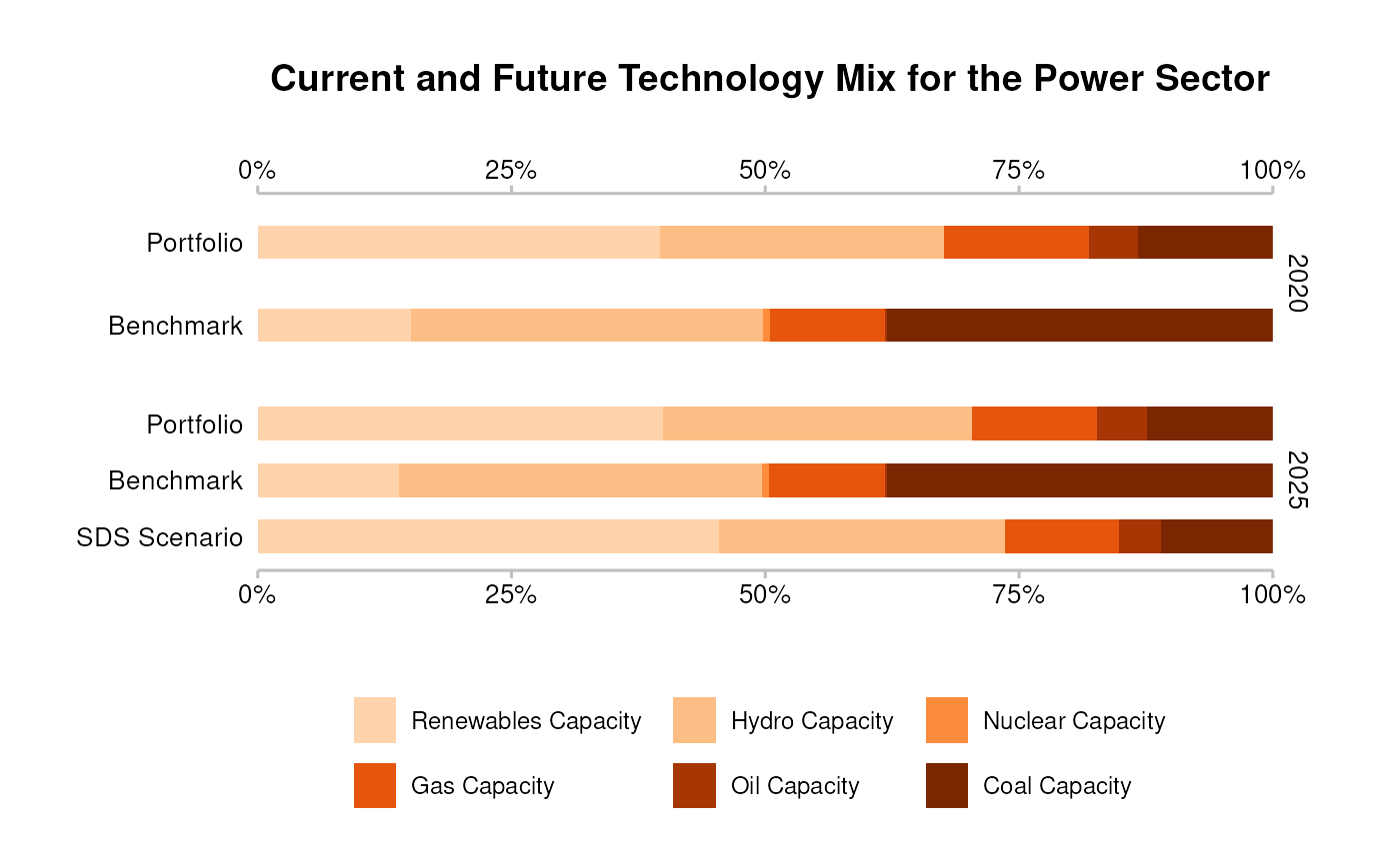
Technology Mix Plot
The technology mix metric tracks shifts in production methods and outputs within the power, fossil fuels and automotive sectors. It captures:
- changes in production technology (e.g., transitioning from coal-fueled to renewable power capacity)
- changes in output type (e.g. shift from internal combustion engines to electric vehicles).
This metric measures the bank’s exposure to the economic activities that are impacted by the transition to a low-carbon economy.
Explanation of Output
The technology mix plot illustrates the share of each technology in a portfolio or company at the analysis start and five years into the future. It compares the portfolio’s projected technology mix to both the benchmark’s technology mix for the selected region and the mix required for alignment with the selected transition scenario. All comparisons are based on assets from the same geographic region as defined in the analysis.
Interpretation & Intuition
The technology mix plot illustrates the effort required to align a portfolio’s technology shares with climate targets. If a portfolio or company has a higher share of low-carbon technologies than the benchmark in a given year, it is considered a leader; if lower, it is a laggard. Alignment with the scenario occurs when the portfolio’s future low-carbon technology shares meet or exceed those in the scenario’s technology mix.
The core principle is that all technologies in a sector produce equivalent outputs (e.g., a MWh of electricity, regardless of source). From a climate impact perspective, a higher share of low-carbon technologies is preferable. From a financial risk perspective, the implications depend on market expectations. If, for example, transition risk is expected to materialize through carbon pricing, then higher low-carbon shares reduce risk. However, if other factors influence sector transitions, selecting a scenario that mirrors expected market trends can help mitigate that risk.
To fully assess alignment, technology mix should be evaluated alongside production volume trajectory, as the technology mix plot alone does not indicate whether overall output is increasing or decreasing, even if a scenario prescribes a specific production trend.
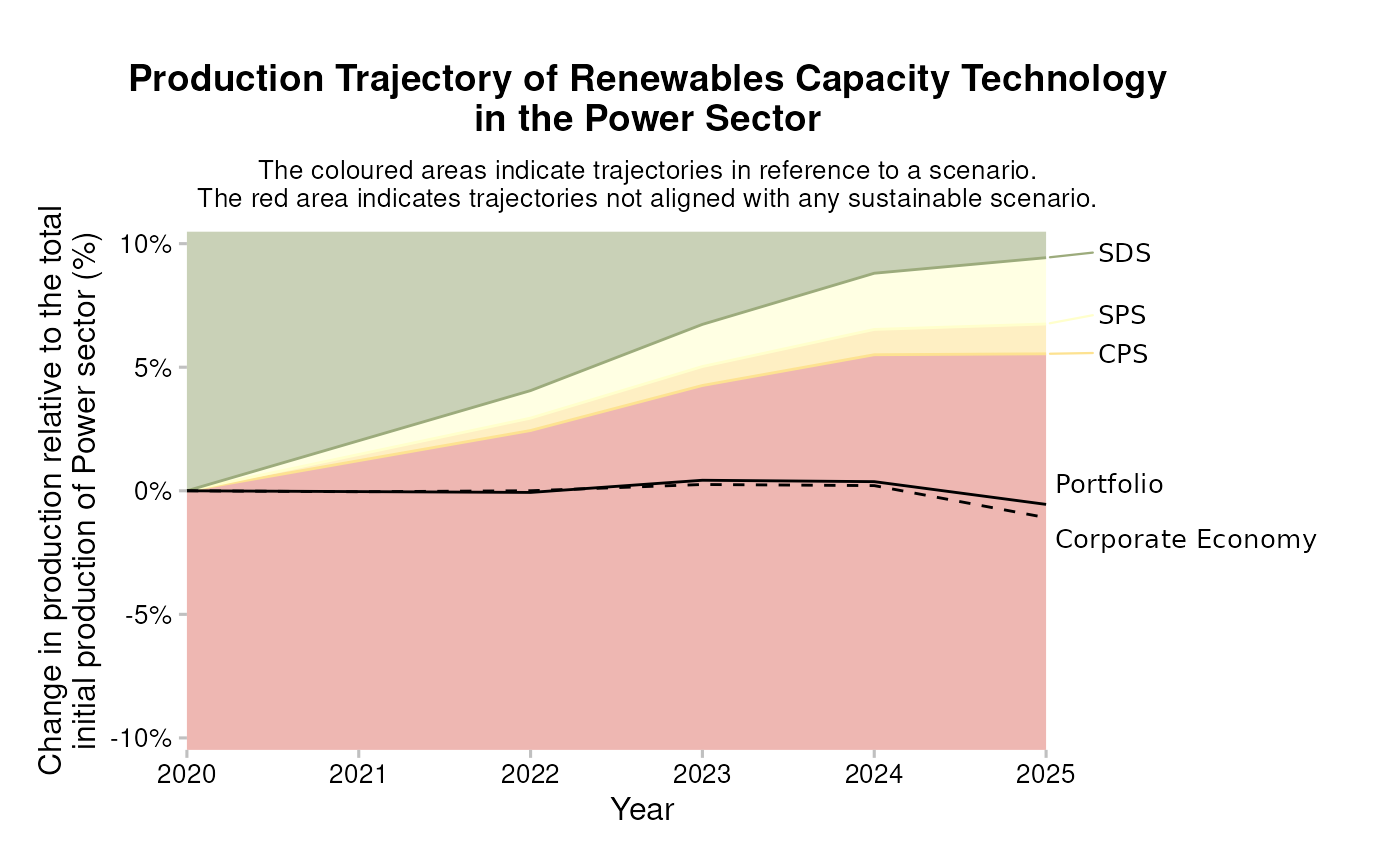
Trajectory Plot
The production volume trajectory metric evaluates a portfolio’s alignment with climate scenarios by comparing projected production volumes—based on companies’ five-year capital expenditure plans—to scenario pathways. It applies to the fossil fuels, power, and automotive sectors, where production changes occur either through shifts between technologies (e.g., internal combustion engines to electric vehicles) or overall expansion/contraction (e.g., closing down coal mines). The trajectory reflects these changes at the technology level for individual clients and is compared to climate scenario trends.
Explanation of Output
The trajectory plot displays a portfolio’s production volume for a specific technology or fuel type, tracking changes from the start year to five years into the future (solid black line). This projection is compared to the benchmark’s production trajectory for the selected region (dashed black line). The plot’s background is color-coded: green indicates alignment with ambitious climate scenarios, red signifies misalignment, and shades of yellow for in-between. For low-carbon technologies, values above the most ambitious scenario appear green, and those below the least ambitious scenario appear red; the opposite applies to high-carbon technologies. Typically, the plot includes multiple scenarios but can also compare the portfolio against a single scenario.
Interpretation & Intuition
A portfolio is aligned with a climate scenario if its production trajectory (solid black line) follows the scenario line. Low-carbon technologies generally require increasing production under ambitious scenarios, whereas high-carbon technologies must decline or phase-out. If a portfolio scales up low-carbon production faster than the scenario, it supports the transition; if it lags, it slows progress.
More ambitious scenarios assume stronger shifts toward low-carbon solutions, leading to lower global heating outcomes. Thus, the degree of ambition in a portfolio’s production trajectory directly correlates to its alignment with climate targets.
Sectoral Decarbonization (SDA) Target
The sectoral decarbonization approach (SDA) calculates PACTA alignment metrics for aviation, cement, and steel—sectors. These sectors are considered “hard-to-abate” due to the lack of market-ready low-carbon alternatives. As a result, there are no clear production-pathways at the level of technology or fuel-type. Unlike the market share approach, which tracks technology shifts, the SDA evaluates sector-level emission intensities (e.g., tonnes of CO2 per tonne of cement or steel produced), providing a comparable measure across all production methods.
The SDA determines the required carbon intensity for a sector—as specified by a climate scenario—by dividing a sector-specific carbon budget by expected production volumes. The starting emission intensity is calculated as current GHG emissions divided by total sector output. To align with the scenario, companies must follow an individual decarbonization trajectory that starts at their current emission intensity and converges with a common sector-wide target by the scenario’s endpoint (e.g., 2050). Companies with lower initial intensities require less reduction than those above the sector average. If all companies in a sector decarbonize their production in such a way that their average emission intensity converges to the sectoral target, then the scenario target will be reached in aggregate.
For more details on the Sectoral Decarbonization (SDA) metric and its calculation, see the Metrics appendix.
target_sda() function
The target_sda() function calculates the Sectoral
Decarbonization Target metric, producing a table that includes the
calculated targets at the portfolio or company level, depending on the
options selected.
Explanation of Output
The primary variable of interest in the output is
emission_factor_value, which represents an emission
intensity depending on the possible values of the
emission_factor_metric column`:
-
"projected": The portfolio’s physical emission intensity based on ABCD data for the sector, year, region, and scenario. -
"target_*"(e.g.,"target_cps"): The scenario-aligned individual target emission intensity, starting from the portfolio’s initial intensity and converging with the sector-level scenario target by the final year. -
"corporate_economy": The weighted average emission intensity of the entire sector, serving as a benchmark for comparison. -
"adjusted_*": The scenario trajectory for emission intensity, adjusted for differences between ABCD sector totals and scenario data.
When by_company = TRUE, the output is specific to the
company listed in the name_abcd column.
For detailed information about the table output of the
target_sda() function and its columns, see the data dictionary.
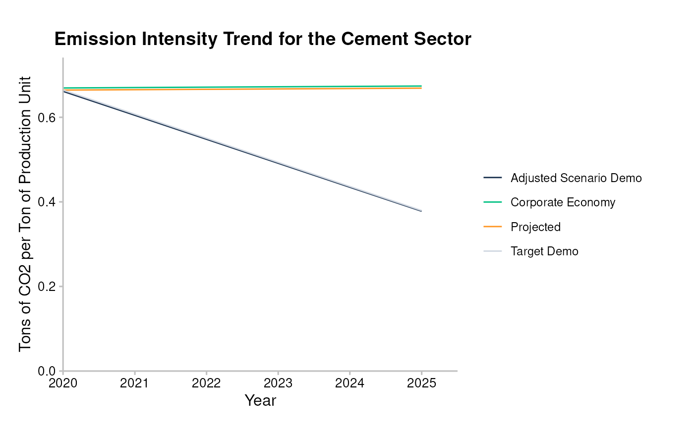
Emission Intensity Plot
The emission intensity metric measures the average CO2 intensity of a portfolio in the aviation, cement, and steel sectors, expressed as CO2 per unit of economic output (e.g., CO2 per ton of steel produced). This five-year forward-looking trajectory is compared to an emission intensity reference trend based on a climate transition scenario.
This metric is used for sectors without clear technology pathways or scalable zero-carbon alternatives (namely, aviation, cement and steel). Since technology mix and production volume trajectory metrics are not applicable, emission intensity serves as the primary measure for assessing alignment and guiding capital toward emissions reductions in these sectors.
Explanation of Output
The emission intensity plot visualizes the projected emission intensity of a portfolio or company (labeled “Projected”) for a given sector. This is compared to:
- “Target”: The portfolio’s emission intensity target, which starts at the same initial value and converges toward a common sector-wide target by the scenario’s endpoint.
- “Corporate Economy”: The sector’s benchmark trajectory, representing the average emission intensity across all companies in the sector and region. This starting value may differ from the portfolio’s.
- “Adjusted Scenario”: The sector-wide scenario target, based on all companies in the benchmark group. This trend line indicates where the portfolio’s emission intensity should align by the scenario’s end (often 2050, though not always shown).
Interpretation & Intuition
The portfolio or company’s starting emission intensity relative to the sector benchmark indicates whether it is a leader or laggard. A higher-than-average starting value means the portfolio must decarbonize at a steeper rate to reach the sector-wide target by the scenario’s endpoint. Alignment with the scenario requires the portfolio’s emission intensity to decline at least as fast as its target trajectory; failing to do so shifts the burden onto other market participants and risks misalignment.
The core intuition behind the emission intensity plot is that lower emission intensity leads to lower absolute emissions, assuming sector-wide production remains constant. This reduction translates to fewer greenhouse gas emissions and, ultimately, mitigates global heating.
PREVIOUS CHAPTER: Running the Analysis
NEXT CHAPTER: Advanced Use Cases