Compared to plot_techmix() this function:
is restricted to plotting future as 5 years from the start year,
outputs pretty bar labels, based on metric column,
outputs pretty legend labels, based on technology column,
outputs a title.
Arguments
- data
A data frame like the output of
prep_techmix().
Examples
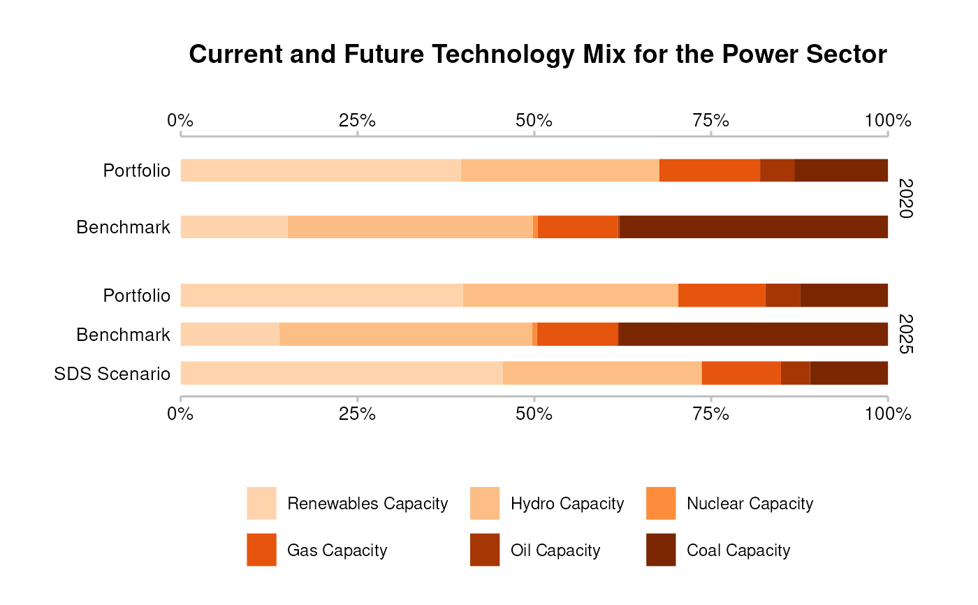
# `data` must meet documented "Requirements"
data <- subset(
  market_share_demo,
  sector == "power" &
    region == "global" &
    scenario_source == "demo_2020" &
    metric %in% c("projected", "corporate_economy", "target_sds")
)

qplot_techmix(data)
#> The `technology_share` values are plotted for extreme years.
#> Do you want to plot different years? E.g. filter . with:`subset(., year %in% c(2020, 2030))`.